Blurb
A series of static graphics I’ve created using QGIS.
My role
- Data wrangling
- Designer
Tools
- QGIS
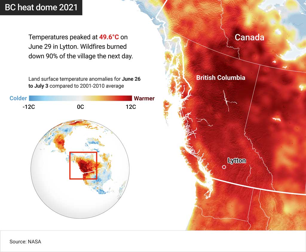

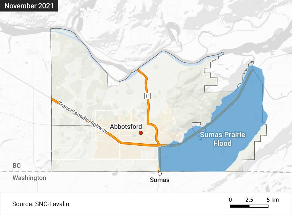

A series of static graphics I’ve created using QGIS.

Global News
This desktop application displays wildfire data from the BC government in Canada. It is used on a touchscreen TV for in-studio live hits for Global News BC.
For the best experience, press F11 or Fn + F11 on Windows, or Cmd + Ctrl + F on a Mac device to view the interactive in full screen.
The project embedded on this page is a streamlined version of the desktop app and features a free version of the satellite base-map and dummy data for presentation purposes.
The backend was built using the Rust-based Tauri framework and uses Rust code to grab data from the BC government’s open data portal.
The data is then compressed via an embedded Mapshaper application and visualised on the frontend using SvelteKit (TypeScript), OpenLayers and MapLibre.

A semi-advanced income tax calculator for the UK’s 2024/25 tax year. Created as a personal project with HTML, CSS, JavaScript and Svelte.

Global News
A visual record of crimes reported across BC from 2012 to 2022. It was made using the Svelte framework along with D3, JavaScript, HTML, and CSS. R was used to clean up and prepare the data for visualization, as well as Mapshaper to prepare the geometric data.

Global News
A visual breakdown of how much BC’s elected representatives were paid and how much they spent on travel and office costs from April 1, 2022 to March 31, 2023.
The data was sourced from the Legislative Assembly of British Columbia and scraped from PDFs using R library Tabulizer. The graphic itself was designed using Figma, and built with Svelte, D3, JavaScript, HTML, and CSS. The final look and functionality of the graphic evolved following user testing.
Please click on the image to enlarge it:


Global News
These three calculators feature in Global News’ evergreen story on inflation and its rollercoaster effect on mortgage payments. It was created using the Svelte framework and built with JavaScript, HTML, CSS and the decimal.js library for mathematical accuracy.
Read more: https://globalnews.ca/news/9742818/bc-mortgage-calculator-simple/

A series of responsive charts I’ve created using R, Python, D3, JavaScript, HTML and CSS.
An interactive line chart created with R packages ggplot2 and ggiraph. The data was scraped directly from CATSA using Microsoft Excel, and restructured and analysed with R:
An interactive stacked bar chart created with ggplot2 and ggiraph. The data was pulled from an Angus Reid survey and analysed with R:
An interactive donut chart created with D3, HTML, CSS and JavaScript. The data was pulled from Statistics Canada (source 1, source 2) and transformed and analysed with R:
An interactive chart comparing the effectiveness of vaccines against COVID-19. I was inspired to create this after reading this article on how certain COVID-19 data can be more accurately compared using the incidence rate — a figure which shows how often an event, such as disease or death, occurs in a population.
The numbers for this cluster chart were pulled from CDC and cleaned up with Excel. The data centers on information recorded on January 2, 2022 — when infections across 30 US jurisdictions were at their peak.
D3, HTML, CSS and JavaScript were used to create the visualisation. The animated points were drawn with the Canvas API to minimize loading speeds.
An interactive map looking at the shelter-cost-to-income ratio across Canada. The numbers were pulled from Statistics Canada, and transformed and analysed with Python library pandas.
D3, HTML, CSS, JavaScript and Mapshaper were used to create the visualisation:
An interactive waffle chart looking at racial diversity in Canada’s federal parliament. The numbers were taken from a survey and transformed with R.
R packages ggplot2, ggiraph and waffle were used to build the visualisation, which was further customized with D3, HTML, CSS and JavaScript:
An interactive bar chart comparing physician salaries across specialties in the US and Canada. The data was compiled from a Medscape survey and CIHI report released in 2022, and transformed with R.
R packages ggplot2 and ggiraph were used to create the visualisation:
An interactive sankey depicting how a $54 federal million budget was spent on the development of ArriveCAN, a travel app used as a screening tool for travellers entering Canada during the COVID-19 pandemic. The data was taken from the Canada Border Services Agency website and reformatted in Excel.
The diagram was coded in HTML, CSS and JavaScript with D3:
An interactive dot plot presenting the average life expectancy for men and women across Canada, according to the latest available data from Statistics Canada.
The chart was coded in HTML, CSS and JavaScript with D3:
A tree diagram presenting the leadership structure of Hamas, according to the Council on Foreign Relations. It was coded in HTML, CSS and JavaScript with D3:

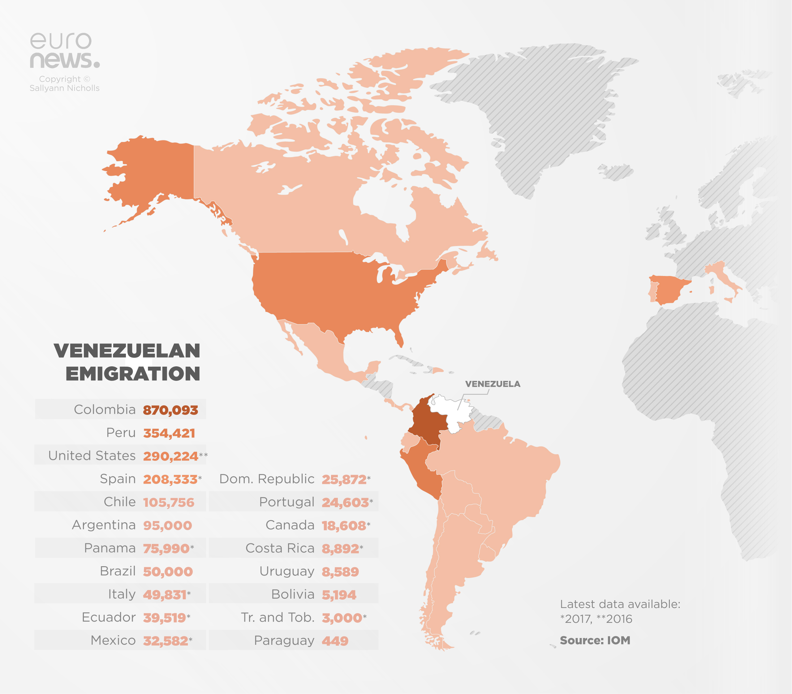
Euronews
A map depicting Venezuelan emigration since the exodus began in 2014. Created for a Euronews feature article.
Read more: https://www.euronews.com/2018/08/28/venezuela-exodus-people-are-leaving-in-order-to-survive-


Euronews
Routes of the Venezuelan migratory flow in North and South America. Created for a Euronews feature article.
Read more: https://www.euronews.com/2018/08/28/venezuela-exodus-people-are-leaving-in-order-to-survive-

Euronews
An interactive tool which details abortion rules for almost every country in Europe until 2018. I created this interactive Q&A embed using HMTL, CSS, Javascript and jQuery. The research was conducted by fellow journalists Alice Cuddy, Stephanie Burnett, and myself.


Euronews
A graphic depicting abortion activists in Poland for a Euronews feature article.

Euronews
A detailed breakdown of Syria’s civil war, from January 2011 until March 2018.
This multimedia-rich, interactive timeline pulls data from a Google Spreadsheet. I created the responsive tool using HTML, CSS, Javascript and jQuery.
NOTE: This timeline is no longer visible on Euronews.com due to Google depreciating its Sheets v3 API.

Daily Record
SNP big guns Alex Salmond and Angus Robertson were ousted by Tories in a shock general election result in 2017.
I created this responsive interactive map to show readers how the election results were distributed across the UK and updated it live during the event. It was made using CARTO’s map API and Leaflet. I filtered the data using SQL, and built the interface with HTML, CSS, JavaScript and jQuery.
Read more: http://www.dailyrecord.co.uk/news/politics/general-election-2017-interactive-map-10589708

Glasgow Live
An in-depth look at crime across the city of Glasgow in Scotland from 2012-2017. This was a self-led project created for Glasgow Live (Reach PLC) and based on crime statistics from Police Scotland, which I requested under the Freedom of Information Act.
The graphic was made using CARTO’s map API and SQL to manage the data, and Leaflet, HTML, CSS, JavaScript and jQuery to visualise it.

Daily Record
Fifteen hours after opening, polling stations for the EU Referendum closed and Brits at home and abroad waited to discover if it was Remain or Brexit for the UK.
Voters had their say in 399 local authority areas and as the majority prepared for bed, the counting began.
I created this responsive interactive map to show readers how the referendum results were distributed and updated it live during the event. It was made using CARTO’s map API, GIS and Leaflet, and SQL to filter its data, as well as HTML, CSS, JavaScript and jQuery.
Read more: https://www.dailyrecord.co.uk/news/politics/eu-referendum-follow-results-each-8270207